

Is Your E-Commerce Store Holding Your Growth Back?
Running a high-value B2B business with specialised machinery requires a digital storefront that reflects expert engineering and precision. When potential buyers land on your site to research £5,000–£10,000+ equipment, every detail shapes their confidence in your brand.
We recently partnered with Freeform Fabrication, a leading UK supplier of industrial 3D printers, laser welders, and engravers, to redesign their online store. Their existing setup had served them well for years, but it was showing its age – costing them precious conversions, search visibility, and brand authority.
Here is an insider look at how we transformed an outdated e-commerce store into a high-converting digital storefront.
-
When analysing the original Freeform Fabrication site, several critical UX and structural issues stood out:
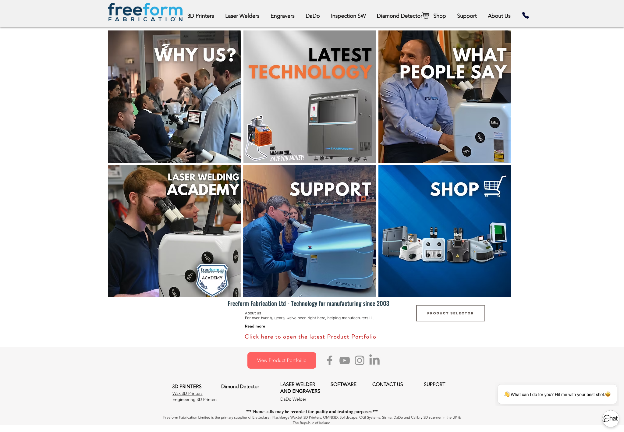
Visual Clutter & Disconnected Grids: The homepage relied on an inconsistent block layout that mixed low-resolution images, misaligned typography, and competing calls-to-action (CTAs).
Confusing Product Architecture: Category pages lacked clean filtering and visual hierarchy. High-ticket items like laser welders were displayed alongside small replacement parts without clear structure.
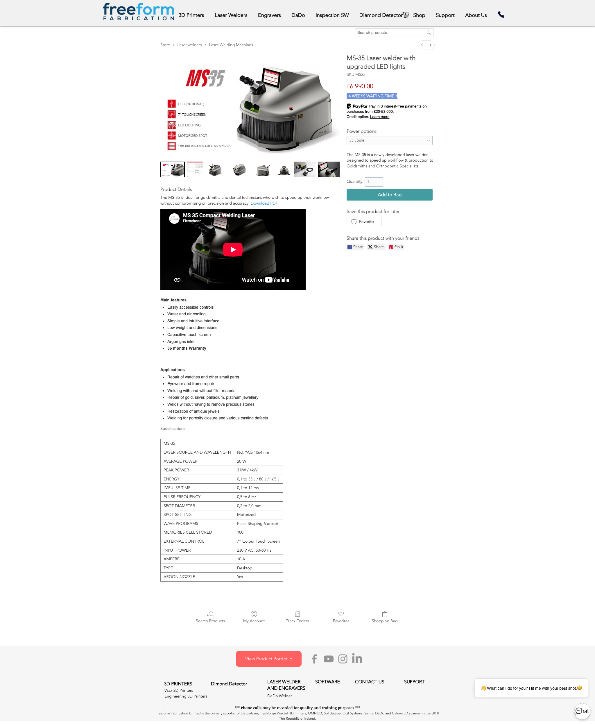
Overwhelmed Product Pages: Individual product pages were dense with plain text tables, buried video embeds, and mismatched graphics, making technical specs difficult to digest quickly.
Dated Trust & Branding Signals: Generic layout elements, small fonts, and non-responsive design patterns failed to capture the premium build quality of the machinery being sold.
-
1. Streamlined Navigation & Logical Category Structure
The Change: Rebuilt the site architecture around primary product families (3D Printers, Laser Welders, Engravers, Accessories).
The Why: High-intent buyers want to find specific machinery quickly without getting lost in endless scrolling.
2. Premium B2B Product Page Layouts
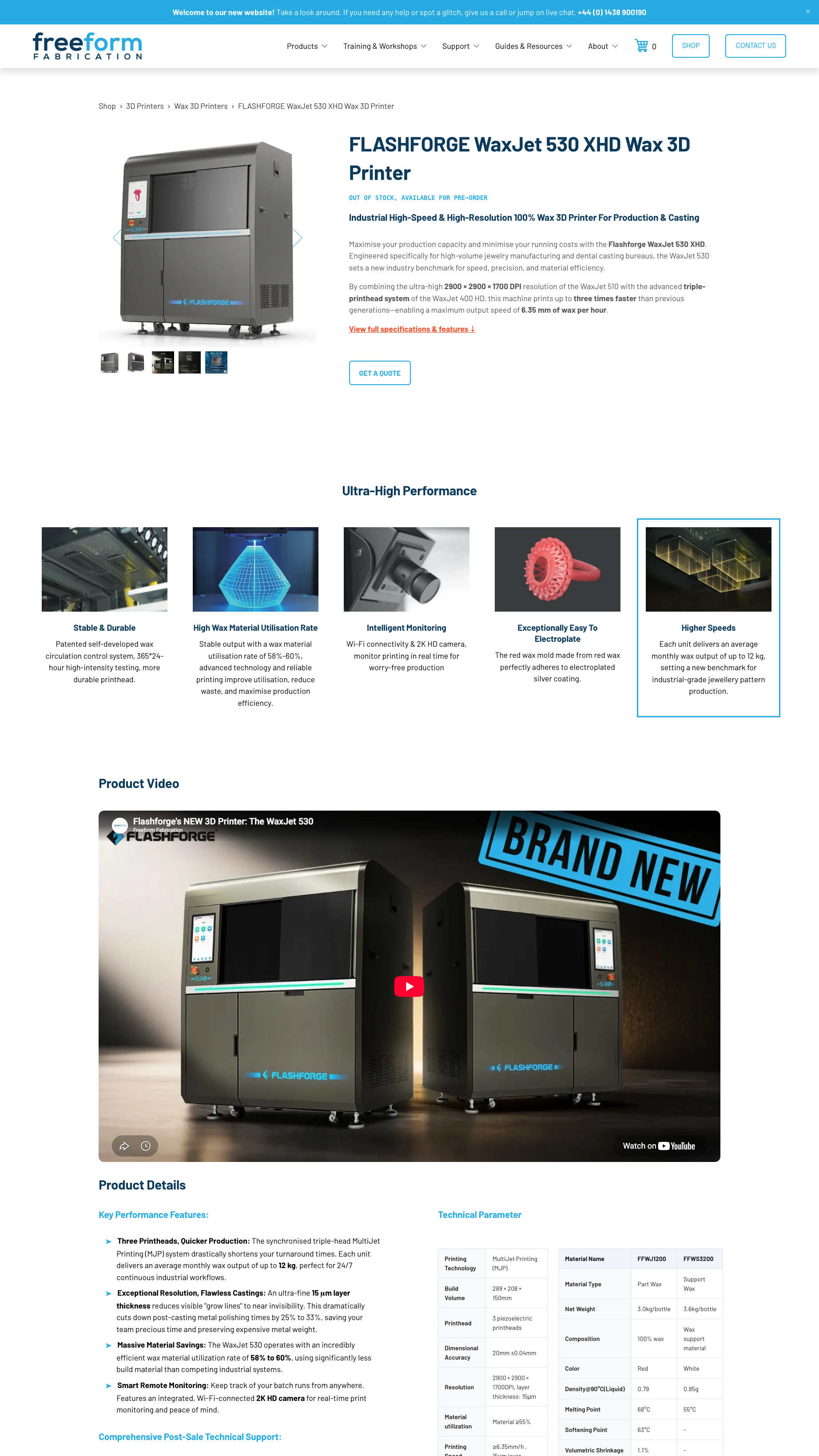
The Change: Redesigned single product pages with high-resolution imagery, clear pricing structures, sticky "Add to Cart / Request Quote" buttons, and organised tabbed specs.
The Why: Technical B2B buyers need clear specifications, finance options, and lead-time transparency up front to make informed purchasing decisions.
3. Modernised Visual Hierarchy & Typography
The Change: Replaced fragmented graphic banners with clean typography, consistent brand colours, and structured whitespace.
The Why: Modern design builds immediate trust. A polished layout signals that your business is established, active, and reliable.
4. Mobile Optimisation & Speed Tuning
The Change: Optimised product assets, stripped out unnecessary scripts, and ensured seamless touch navigation across screens.
The Why: Over 50% of B2B research now happens on mobile devices. Fast load speeds directly reduce bounce rates and boost Google rankings.
-
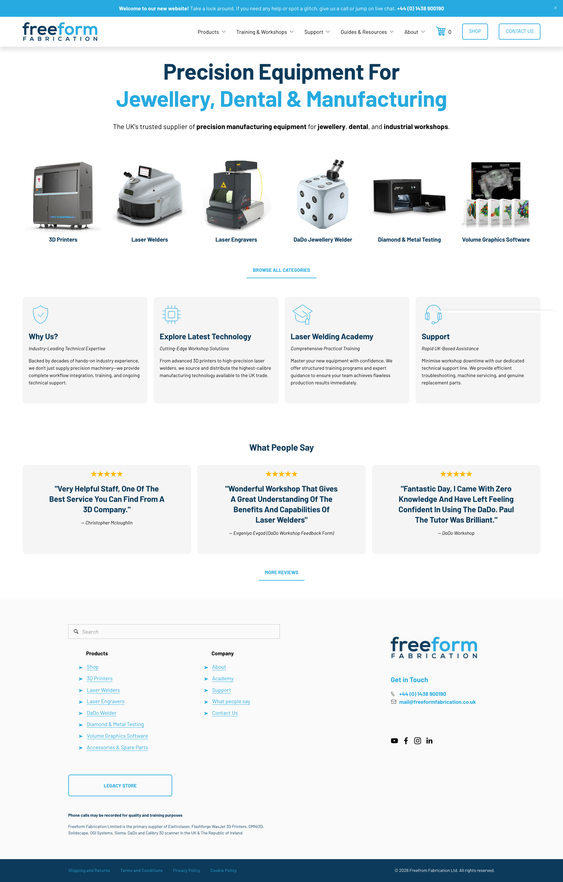
The new Freeform Fabrication site offers an intuitive shopping experience that guides visitors seamlessly from product discovery to enquiry. By pairing clean aesthetics with clear B2B conversion pathways, the brand now has a modern storefront capable of supporting its growth.
“ Thank you so much for all the work you have done. The new site looks amazing! ”
Andrew - FreeForm Fabrication
Before the redesign (Wix)
After Design Fibre redesign (Squarespace)
See the new site in action: www.freeformfabrication.co.uk
Does Your E-Commerce Site Need Some TLC?
If your online shop feels outdated, clunky on mobile, or isn't converting traffic into sales, it might be time for a fresh approach.
Ready to upgrade your online store?
Contact Sam to discuss your website redesign project.